List of figures

List of Figures

Figure 1a: Nominal policy rates worldwide 

Line chart with 8 lines.
The chart has 1 X axis displaying categories.
The chart has 1 Y axis displaying values. Data ranges from 0 to 13.8.
End of interactive chart.

Source: IMF, May 2024


Figure 1b: Real policy rates worldwide 

Line chart with 8 lines.
The chart has 1 X axis displaying categories.
The chart has 1 Y axis displaying values. Data ranges from -5.7 to 9.2.
End of interactive chart.

Source: IMF, May 2024


Figure 2: EU Economic sentiment and employment expectations (seasonally adjusted)

Line chart with 3 lines.
The chart has 1 X axis displaying categories.
The chart has 1 Y axis displaying values. Data ranges from 52.3 to 118.7.
End of interactive chart.

Source: Commission Forecasts, May 2024


Figure 3a: EURO STOXX (SXXP) and EURO STOXX for banks (SX7E)

Line chart with 2 lines.
30/12/2022=100
The chart has 1 X axis displaying Time. Data ranges from 2023-05-16 00:00:00 to 2024-06-13 00:00:00.
The chart has 1 Y axis displaying values. Data ranges from 101.1038151 to 155.8627165.
End of interactive chart.

Source: Bloomberg


Figure 3b: 10Y government yields of selected EU countries 

Line chart with 6 lines.
The chart has 1 X axis displaying Time. Data ranges from 2023-05-17 00:00:00 to 2024-06-13 00:00:00.
The chart has 1 Y axis displaying values. Data ranges from 1.893 to 4.979.
End of interactive chart.

Source: Bloomberg


Figure 4: Residential property vs commercial property prices in the EA and EU *

Line chart with 4 lines.
Q4 2013 = 100
The chart has 1 X axis displaying categories.
The chart has 1 Y axis displaying values. Data ranges from 100 to 156.
End of interactive chart.

Source: ECB


Figure 5: Quarterly and yearly growth rates in asset components, December 2022 to December 2023

Combination chart with 5 data series.
The chart has 1 X axis displaying categories.
The chart has 1 Y axis displaying values. Data ranges from -16.5 to 17.3.
End of interactive chart.

Source: EBA supervisory reporting data


Figure 6: Growth in loans and advances by segment, December 2022 to December 2023

Line chart with 8 lines.
December 2022 = 100
The chart has 1 X axis displaying categories.
The chart has 1 Y axis displaying values. Data ranges from 98.8 to 104.5.
End of interactive chart.

Source: EBA supervisory reporting data


Figure 7: EU/EEA banks’ sovereign exposures maturity profile trend (year-end)

Bar chart with 5 data series.
The chart has 1 X axis displaying categories.
The chart has 1 Y axis displaying values. Data ranges from 11.2 to 100.
End of interactive chart.

Source: EBA supervisory reporting data


Figure 8: Portfolios which banks, by region, expect to increase/decrease in volumes in the next 12 months *

Bar chart with 4 data series.
The chart has 1 X axis displaying categories.
The chart has 1 Y axis displaying values. Data ranges from 0 to 100.1.
End of interactive chart.

Source: EBA Risk Assessment Questionnaire


Figure 9: Growth expectations for selected asset classes *

Bar chart with 3 data series.
The chart has 1 X axis displaying categories.
The chart has 1 Y axis displaying values. Data ranges from -8.1 to 4.3.
End of interactive chart.

Source: EBA supervisory reporting data (funding plan data)


Figure 10a: Growth expectations for lending to households by country

Bar chart with 3 data series.
The chart has 1 X axis displaying categories.
The chart has 1 Y axis displaying values. Data ranges from -4.3 to 20.5.
End of interactive chart.

Source: EBA supervisory reporting data (funding plan data)


Figure 10b: Growth expectations for lending to NFCs by country

Bar chart with 3 data series.
The chart has 1 X axis displaying categories.
The chart has 1 Y axis displaying values. Data ranges from -2.4 to 14.2.
End of interactive chart.

Source: EBA supervisory reporting data (funding plan data)


Figure 11: Actual and planned asset composition *

Bar chart with 11 data series.
EUR tn
The chart has 1 X axis displaying categories.
The chart has 1 Y axis displaying values. Data ranges from 3.05 to 30.26.
End of interactive chart.

Source: EBA supervisory reporting data (funding plan data)


Figure 12: Trend of EU/EEA NPL volumes and ratio, September 2022 to December 2023

Combination chart with 2 data series.
EUR bn and %
The chart has 1 X axis displaying categories.
The chart has 2 Y axes displaying values, and values.
End of interactive chart.

Source: EBA supervisory reporting data


Figure 13: NPL cumulative net flows by segment for 2022 and 2023

Bar chart with 4 data series.
EUR bn
The chart has 1 X axis displaying categories.
The chart has 1 Y axis displaying values. Data ranges from -34.36 to 9.56.
End of interactive chart.

Source: EBA supervisory reporting data


Figure 14: NPL ratio by country in December 2023 and p.p. change in NPL ratio QoQ and YoY

Combination chart with 3 data series.
The chart has 1 X axis displaying categories.
The chart has 2 Y axes displaying values, and values.
End of interactive chart.

Source: EBA supervisory reporting data


Figure 15a: NPL ratios of loans (at amortised cost) by segment

Bar chart with 2 data series.
The chart has 1 X axis displaying categories.
The chart has 1 Y axis displaying values. Data ranges from 1.5 to 5.3.
End of interactive chart.

Source: EBA supervisory reporting data


Figure 15b: Allocation of stage 2 loans (at amortised cost) by segment

Bar chart with 2 data series.
The chart has 1 X axis displaying categories.
The chart has 1 Y axis displaying values. Data ranges from 6.9 to 17.8.
End of interactive chart.

Source: EBA supervisory reporting data


Figure 16: Banks’ expectations on possible deterioration in asset quality in the next 12 months by segment

Bar chart with 7 data series.
The chart has 1 X axis displaying categories.
The chart has 1 Y axis displaying values. Data ranges from 15.3 to 71.2.
End of interactive chart.

Source: EBA Risk Assessment Questionnaire


Figure 17: EU/EEA banks’ yearly debt and capital instrument issuances, 2021 to 2023 *

Bar chart with 3 data series.
EUR bn
The chart has 1 X axis displaying categories.
The chart has 1 Y axis displaying values. Data ranges from 13.3 to 196.9.
End of interactive chart.

Source: Dealogic, EBA calculations


Figure 18: Cash asset swap (ASW) spreads of banks’ EUR-denominated debt and capital instruments

Line chart with 5 lines.
in bps
The chart has 1 X axis displaying Time. Data ranges from 2023-01-02 00:00:00 to 2024-06-14 00:00:00.
The chart has 2 Y axes displaying values, and values.
End of interactive chart.

Source: IHS Markit*


Figure 19: MREL-eligible liabilities, by instrument, and by category of banks, for instruments with residual maturities between one and two years

Combination chart with 4 data series.
EUR bn
The chart has 1 X axis displaying categories.
The chart has 1 Y axis displaying values. Data ranges from 0 to 113.9.
End of interactive chart.

Source: Reporting on MREL and TLAC


Figure 20a: YoY evolution of the asset encumbrance ratio of total assets and collateral received, numerator (encumbered assets), and denominator (total assets and collateral received that can be encumbered), between December 2014 and December 2023

Combination chart with 3 data series.
The chart has 1 X axis displaying categories.
The chart has 2 Y axes displaying values, and values.
End of interactive chart.

Source: EBA supervisory reporting data


Figure 20b: QoQ evolution of the asset encumbrance ratio of total assets and collateral received, numerator (encumbered assets), and denominator (total assets and collateral received that can be encumbered), between December 2022 and December 2023

Combination chart with 3 data series.
The chart has 1 X axis displaying categories.
The chart has 2 Y axes displaying values, and values.
End of interactive chart.

Source: EBA supervisory reporting data


Figure 21: Evolution of the weighted average asset encumbrance ratio by country, between December 2022 and December 2023

Bar chart with 2 data series.
The chart has 1 X axis displaying categories.
The chart has 1 Y axis displaying values. Data ranges from 0.9 to 51.1.
End of interactive chart.

Source: EBA supervisory reporting data


Figure 22: Evolution of the share of the main types of asset encumbrance and total volume of encumbrance, from December 2017 to December 2023

Combination chart with 6 data series.
% and EUR tn
The chart has 1 X axis displaying categories.
The chart has 2 Y axes displaying values, and values.
End of interactive chart.

Source: EBA supervisory reporting data


Figure 23a: Non-encumbered assets amount and share of total assets from December 2022 to December 2023

Combination chart with 5 data series.
EUR tn and %
The chart has 1 X axis displaying categories.
The chart has 2 Y axes displaying values, and values.
End of interactive chart.

Source: EBA supervisory reporting data


Figure 23b: Non-encumbered assets amount and share of total assets by country as at December 2023

Combination chart with 5 data series.
EUR tn and %
The chart has 1 X axis displaying categories.
The chart has 2 Y axes displaying values, and values.
End of interactive chart.

Source: EBA supervisory reporting data


Figure 23c: Non-encumbered assets amount and share of total assets by country as at December 2023

Combination chart with 5 data series.
EUR tn and %
The chart has 1 X axis displaying categories.
The chart has 2 Y axes displaying values, and values.
End of interactive chart.

Source: EBA supervisory reporting data


Figure 24: EU/EEA average fair value to carrying amount of non-encumbered debt securities from December 2022 to December 2023

Line chart with 2 lines.
The chart has 1 X axis displaying categories.
The chart has 1 Y axis displaying values. Data ranges from 96.5 to 97.9.
End of interactive chart.

Source: EBA supervisory reporting data


Figure 25: Funding composition 2023 to 2026

Bar chart with 12 data series.
EUR tn
The chart has 1 X axis displaying categories.
The chart has 1 Y axis displaying values. Data ranges from 1.1 to 28.
End of interactive chart.

Source: EBA supervisory reporting data (funding plan data)


Figure 26: Public sector sources of funding

Bar chart with 5 data series.
outstanding volume, EUR bn
The chart has 1 X axis displaying categories.
The chart has 1 Y axis displaying values. Data ranges from 12.2 to 503.4.
End of interactive chart.

Source: EBA supervisory reporting data (funding plan data)


Figure 27: Growth expectations for selected liability classes

Bar chart with 3 data series.
The chart has 1 X axis displaying categories.
The chart has 1 Y axis displaying values. Data ranges from -50 to 5.2.
End of interactive chart.

Source: EBA supervisory reporting data (funding plan data)


Figure 28: Net issuance volume by country and year (short and long-term debt securities)

Bar chart with 3 data series.
EUR bn; positive difference means that gross issuances are larger than redemptions for that year, negative difference vice versa
The chart has 1 X axis displaying categories.
The chart has 1 Y axis displaying values. Data ranges from -16.6 to 85.9.
End of interactive chart.

Source: EBA supervisory reporting data (funding plan data)


Figure 29: Unsecured debt instruments – stock volume

Bar chart with 6 data series.
EUR bn
The chart has 1 X axis displaying categories.
The chart has 1 Y axis displaying values. Data ranges from 87.1 to 2702.8.
End of interactive chart.

Source: EBA supervisory reporting data (funding plan data)


Figure 30: Unsecured debt issuance and maturing volume

Bar chart with 6 data series.
EUR bn
The chart has 1 X axis displaying categories.
The chart has 1 Y axis displaying values. Data ranges from 131.4 to 498.7.
End of interactive chart.

Source: EBA supervisory reporting data (funding plan data)


Figure 31: Secured debt issuance and maturing volume

Bar chart with 3 data series.
EUR bn
The chart has 1 X axis displaying categories.
The chart has 1 Y axis displaying values. Data ranges from 12 to 362.5.
End of interactive chart.

Source: EBA supervisory reporting data (funding plan data)


Figure 32: EU/EEA banks’ debt and capital instrument issuances, YtD as of 15 June of the years 2022 to 2024 *

Bar chart with 3 data series.
EUR bn
The chart has 1 X axis displaying categories.
The chart has 1 Y axis displaying values. Data ranges from 4.3 to 131.1.
End of interactive chart.

Source: Dealogic


Figure 33: LCR and NSFR, actual and forecasts

Combination chart with 2 data series.
The chart has 1 X axis displaying categories.
The chart has 2 Y axes displaying values, and values.
End of interactive chart.

Source: EBA supervisory reporting data


Figure 34: Capital ratios (transitional definitions) and leverage ratio

Combination chart with 4 data series.
The chart has 1 X axis displaying categories.
The chart has 1 Y axis displaying values. Data ranges from 4 to 20.03.
End of interactive chart.

Source: EBA supervisory reporting data


Figure 35: CET1 requirements and Pillar 2 Guidance vs CET1 ratio (transitional definition) *

Combination chart with 8 data series.
The chart has 1 X axis displaying categories.
The chart has 1 Y axis displaying values. Data ranges from 4.5 to 16.1.
End of interactive chart.

Source: EBA supervisory reporting data


Figure 36: CET1 requirements and Pillar 2 Guidance vs CET1 ratio (transitional definition) by country

Combination chart with 8 data series.
The chart has 1 X axis displaying categories.
The chart has 1 Y axis displaying values. Data ranges from 4.5 to 23.9.
End of interactive chart.

Source: EBA supervisory reporting data


Figure 37: Dividends and share buy-backs (in EUR bn, lhs) and payout ratio (rhs)

Combination chart with 4 data series.
EUR bn and %
The chart has 1 X axis displaying categories.
The chart has 2 Y axes displaying values, and values.
End of interactive chart.

Source: EBA supervisory reporting data


Figure 38a: Credit risk – share of different components in exposure amounts over time

Bar chart with 8 data series.
The chart has 1 X axis displaying categories.
The chart has 1 Y axis displaying values. Data ranges from 3 to 27.4.
End of interactive chart.

Source: EBA supervisory reporting data


Figure 38b: Credit risk – share of different components in RWAs over time

Bar chart with 8 data series.
The chart has 1 X axis displaying categories.
The chart has 1 Y axis displaying values. Data ranges from 1.6 to 48.5.
End of interactive chart.

Source: EBA supervisory reporting data


Figure 39a: IRB parameter PD for selected exposures classes

Line chart with 3 lines.
The chart has 1 X axis displaying categories.
The chart has 1 Y axis displaying values. Data ranges from 2.4 to 4.2.
End of interactive chart.

Source: EBA supervisory reporting data


Figure 39b: IRB parameter LGD for selected exposures classes

Line chart with 3 lines.
The chart has 1 X axis displaying categories.
The chart has 1 Y axis displaying values. Data ranges from 20.2 to 33.1.
End of interactive chart.

Source: EBA supervisory reporting data


Figure 40: RoE and contribution of the main P&L items to the RoE, comparison between December 2022 and December 2023

Chart with 12 data points. A waterfall chart is a column chart where each column contributes towards a total end value.
The chart has 1 X axis displaying categories.
The chart has 1 Y axis displaying values. Data ranges from 6 to 11.141.
End of interactive chart.

Source: EBA supervisory reporting data


Figure 41: Evolution of EU/EEA RoA, between December 2022 and December 2023

Line chart with 5 data points.
The chart has 1 X axis displaying categories.
The chart has 1 Y axis displaying values. Data ranges from 0.52 to 0.72.
End of interactive chart.

Source: EBA supervisory reporting data


Figure 42: Year-on-year variation of NII as a percentage of equity, between December 2022 and December 2023

Line chart with 6 data points.
The chart has 1 X axis displaying categories.
The chart has 1 Y axis displaying values. Data ranges from 18.9 to 22.
End of interactive chart.

Source: EBA supervisory reporting data


Figure 43: Year-on-year variation of net interest margin by country

Combination chart with 2 data series.
The chart has 1 X axis displaying categories.
The chart has 1 Y axis displaying values. Data ranges from 85 to 285.
End of interactive chart.

Source: EBA supervisory reporting data


Figure 44: Evolution of cost base on equity, between December 2022 and December 2023

Chart with 5 data series.
The chart has 1 X axis displaying categories.
The chart has 1 Y axis displaying values. Data ranges from 10.3 to 24.
End of interactive chart.

Source: EBA supervisory reporting data


Figure 45a: Banks’ level of engagement with CBDCs for what responding banks define as their home market

Bar chart with 4 bars.
The chart has 1 X axis displaying categories.
The chart has 1 Y axis displaying values. Data ranges from 8.2 to 55.3.
End of interactive chart.

Source: EBA Risk Assessment Questionnaire


Figure 45b: CBDCs impact as expected by banks for what responding banks define as their home market

Bar chart with 3 data series.
The chart has 1 X axis displaying categories.
The chart has 1 Y axis displaying values. Data ranges from 3.5 to 62.4.
End of interactive chart.

Source: EBA Risk Assessment Questionnaire


Figure 46a: Interest rates on deposits by segment

Bar chart with 4 data series.
The chart has 1 X axis displaying categories.
The chart has 1 Y axis displaying values. Data ranges from -0.5 to 4.2.
End of interactive chart.

Source: EBA supervisory reporting data (funding plan data)


Figure 46b: Interest rates on loans by segment

Bar chart with 4 data series.
The chart has 1 X axis displaying categories.
The chart has 1 Y axis displaying values. Data ranges from 0.9 to 4.9.
End of interactive chart.

Source: EBA supervisory reporting data (funding plan data)


Figure 47: Actual and forecasted spread between client loans and client deposits (households and NFCs)

Bar chart with 4 data series.
in p.p.
The chart has 1 X axis displaying categories.
The chart has 1 Y axis displaying values. Data ranges from 1.2 to 6.5.
End of interactive chart.

Source: EBA supervisory reporting data (funding plan data)


Figure 48a: Actual and forecasted interest rates for secured debt instruments

Bar chart with 3 data series.
The chart has 1 X axis displaying categories.
The chart has 1 Y axis displaying values. Data ranges from 1.2 to 3.4.
End of interactive chart.

Source: EBA supervisory reporting data (funding plan data)


Figure 48b: Actual and forecasted interest rates for unsecured debt instruments

Bar chart with 3 data series.
The chart has 1 X axis displaying categories.
The chart has 1 Y axis displaying values. Data ranges from 1.7 to 6.7.
End of interactive chart.

Source: EBA supervisory reporting data (funding plan data)

Figure 49: Main drivers of operational risk as seen by banks *

Bar chart with 7 data series.
The chart has 1 X axis displaying categories.
The chart has 1 Y axis displaying values. Data ranges from 0 to 80.
End of interactive chart.

Source: EBA Risk Assessment Questionnaire


Figure 50: Number of successful cyber-attacks resulting in ‘major ICT-related incidents’ in the last semi-annual assessment period *

Bar chart with 4 data series.
The chart has 1 X axis displaying categories.
The chart has 1 Y axis displaying values. Data ranges from 0 to 100.
End of interactive chart.

Source: EBA Risk Assessment Questionnaire


Figure 51a: Financial crime risks in 2023 (cumulative numbers per month)

Line chart with 12 data points.
The chart has 1 X axis displaying categories.
The chart has 1 Y axis displaying values. Data ranges from 115 to 882.
End of interactive chart.

Source: EuReCA (EBA’s AML/CFT database)


Figure 51b: Financial crime risks in 2023 (Where do material weaknesses occur?)

Bar chart with 5 data series.
The chart has 1 X axis displaying categories.
The chart has 1 Y axis displaying values. Data ranges from 31 to 341.
End of interactive chart.

Source: EuReCA (EBA’s AML/CFT database)


Figure 51c: Financial crime risks in 2023 (What are the top 5 types of measures?)

Bar chart with 5 data series.
The chart has 1 X axis displaying categories.
The chart has 1 Y axis displaying values. Data ranges from 35 to 109.
End of interactive chart.

Source: EuReCA (EBA’s AML/CFT database)


Figure 51d: Financial crime risks in 2023 (What are the top 5 sectors where material weaknesses are identified?)

Bar chart with 6 data series.
The chart has 1 X axis displaying categories.
The chart has 1 Y axis displaying values. Data ranges from 12 to 95.
End of interactive chart.

Source: EuReCA (EBA’s AML/CFT database)


Figure 52: Green Street pan-European commercial property price index *

Combination chart with 2 data series.
The chart has 1 X axis displaying categories.
The chart has 2 Y axes displaying values, and values.
End of interactive chart.

Source: Green Street


Figure 52: Green Street pan-European commercial property price index *

Combination chart with 2 data series.
The chart has 1 X axis displaying categories.
The chart has 2 Y axes displaying values, and values.
End of interactive chart.

Source: Green Street


Figure 53a: Year-on-year change in commercial property prices for selected countries *

Bar chart with 2 data series.
The chart has 1 X axis displaying categories.
The chart has 1 Y axis displaying values. Data ranges from -14.2 to 19.
End of interactive chart.

Source: BIS Data Portal, ECB Statistical Datawarehouse (SDW), EBA calculations


Figure 53b: Trends in office vs retail prices for selected countries *

Line chart with 6 lines.
Q4 2019 = 100
The chart has 1 X axis displaying categories.
The chart has 1 Y axis displaying values. Data ranges from 77.7 to 125.9.
End of interactive chart.

Source: BIS Data Portal, ECB Statistical Datawarehouse (SDW), EBA calculations


Figure 54: Share prices of selected European REITs *

Line chart with 7 lines.
relative, since 2 January 2020, YtD
The chart has 1 X axis displaying Time. Data ranges from 2020-01-02 00:00:00 to 2024-06-13 00:00:00.
The chart has 1 Y axis displaying values. Data ranges from -75.36 to 65.57.
End of interactive chart.

Source: S&P Capital IQ


Figure 55: EU/EEA banks’ exposure to loans collateralised by CREs – December 2014 to December 2023

Combination chart with 2 data series.
% and EUR bn
The chart has 1 X axis displaying categories.
The chart has 2 Y axes displaying values, and values.
End of interactive chart.

Source: EBA supervisory reporting data


Figure 56: Loans collateralised by CREs and share of loans collateralised by CREs to total NFC and household loans by country – December 2019 and December 2023 *

Combination chart with 3 data series.
% and EUR bn
The chart has 1 X axis displaying categories.
The chart has 2 Y axes displaying values, and values.
End of interactive chart.

Source: EBA supervisory reporting data


Figure 57: Loan collateralised by CREs towards the country of domicile of counterparty – December 2023

Chart with 149 data points.
EUR bn
End of interactive chart.

Source: EBA supervisory reporting data


Figure 58: Loan-to-value ratios of loans collateralised by CREs by country and total CRE loans – December 2023

Combination chart with 5 data series.
% and EUR bn
The chart has 1 X axis displaying categories.
The chart has 2 Y axes displaying values, and values.
End of interactive chart.

Source: EBA supervisory reporting data


Figure 59: Share of outstanding CRE loans repricing in less than 12 months

Bar chart with 5 data series.
The chart has 1 X axis displaying categories.
The chart has 1 Y axis displaying values. Data ranges from 3.8 to 61.5.
End of interactive chart.

Source: EBA Risk Assessment Questionnaire


Figure 60: Trends in NPL and IFRS 9 stage 2 allocation volumes and ratio of CRE exposures – December 2014 to December 2023 *

Combination chart with 4 data series.
EUR bn
The chart has 1 X axis displaying categories.
The chart has 2 Y axes displaying values, and values.
End of interactive chart.

Source: EBA supervisory reporting data


Figure 61: NPL and IFRS 9 stage 2 allocation ratio by country for CRE exposures – December 2022 and December 2023

Combination chart with 4 data series.
The chart has 1 X axis displaying categories.
The chart has 2 Y axes displaying values, and values.
End of interactive chart.

Source: EBA supervisory reporting data


Figure 62a: Trend NPL inflows/outflows of EU/EEA banks related to CRE exposures

Bar chart with 2 data series.
EUR bn
The chart has 1 X axis displaying categories.
The chart has 1 Y axis displaying values. Data ranges from -40.51 to 28.56.
End of interactive chart.

Source: EBA supervisory reporting data


Figure 62b: NPL inflows/outflows related to CRE exposures by country in 2023

Bar chart with 2 data series.
EUR bn
The chart has 1 X axis displaying categories.
The chart has 1 Y axis displaying values. Data ranges from -4.36 to 10.75.
End of interactive chart.

Source: EBA supervisory reporting data


Figure 63: Asset quality expectations for CRE loans by region

Bar chart with 4 data series.
The chart has 1 X axis displaying categories.
The chart has 1 Y axis displaying values. Data ranges from 0 to 101.
End of interactive chart.

Source: EBA Risk Assessment Questionnaire


Figure 64: Coverage ratios of performing and non-performing CRE loans by country – December 2023

Combination chart with 3 data series.
The chart has 1 X axis displaying categories.
The chart has 2 Y axes displaying values, and values.
End of interactive chart.

Source: EBA supervisory reporting data


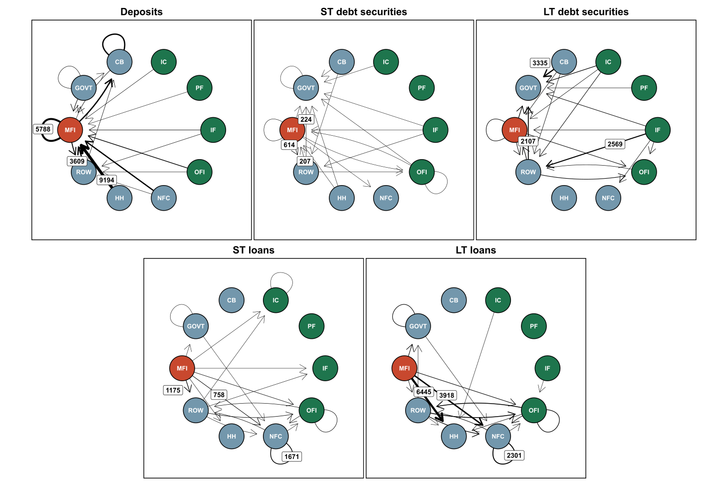
Figure 65: Network of the EA financial system comprising links between the banking sector and other sectors of the economy, December 2023 (the values of the three largest exposures are shown next to the respective arrow in each of the charts) (EUR bn)

Network of the EA financial system comprising links between the banking sector and other sectors of the economy, December 2023 (the values of the three largest exposures are shown next to the respective arrow in each of the charts) (EUR bn)


Figure 66a: EU/EEA banks’ asset exposures to the non-bank sector, as share of total assets, December 2023
Combination chart with 7 data series.
The chart has 1 X axis displaying categories.
The chart has 1 Y axis displaying values. Data ranges from 2.3 to 9.7.
End of interactive chart.

Source: EBA supervisory reporting data


Figure 66b: EU/EEA banks’ liability to the non-bank sector (excluding market-based funding), as share of total assets, December 2023
Combination chart with 6 data series.
The chart has 1 X axis displaying categories.
The chart has 1 Y axis displaying values. Data ranges from 2.3 to 14.3.
End of interactive chart.

Source: EBA supervisory reporting data


Figure 67: Evolution of EU/EEA banks’ asset exposures to the non-bank sector, as share of total assets, June 2021 to December 2023
Bar chart with 11 data series.
The chart has 1 X axis displaying categories.
The chart has 1 Y axis displaying values. Data ranges from 0.3 to 2.98.
End of interactive chart.

Source: EBA supervisory reporting data


Figure 68: Concentration of EU/EEA banks’ asset exposures to the non-bank sector, December 2023
Line chart with 2 lines.
The chart has 1 X axis displaying categories.
The chart has 1 Y axis displaying values. Data ranges from 0.2 to 100.
End of interactive chart.

Source: EBA supervisory reporting data


Figure 69a: Composition of main funding counterparties, December 2023 *
Bar chart with 7 data series.
The chart has 1 X axis displaying categories.
The chart has 1 Y axis displaying values. Data ranges from 21.421421421421 to 100.
End of interactive chart.

Source: EBA supervisory reporting data


Figure 69b: Funding from NBFI main funding counterparties by product type, December 2023
Pie chart with 7 slices.
End of interactive chart.

Source: EBA supervisory reporting data


Figure 70a: Share of loan commitments, financial guarantees and other commitments given to NBFIs, December 2023
Combination chart with 4 data series.
The chart has 1 X axis displaying categories.
The chart has 1 Y axis displaying values. Data ranges from 4.3 to 7.5.
End of interactive chart.

Source: EBA supervisory reporting data


Figure 70b: Loan commitments, financial guarantees and other commitments received from NBFIs, December 2023
Combination chart with 4 data series.
The chart has 1 X axis displaying categories.
The chart has 1 Y axis displaying values. Data ranges from 0.1 to 9.6.
End of interactive chart.

Source: EBA supervisory reporting data


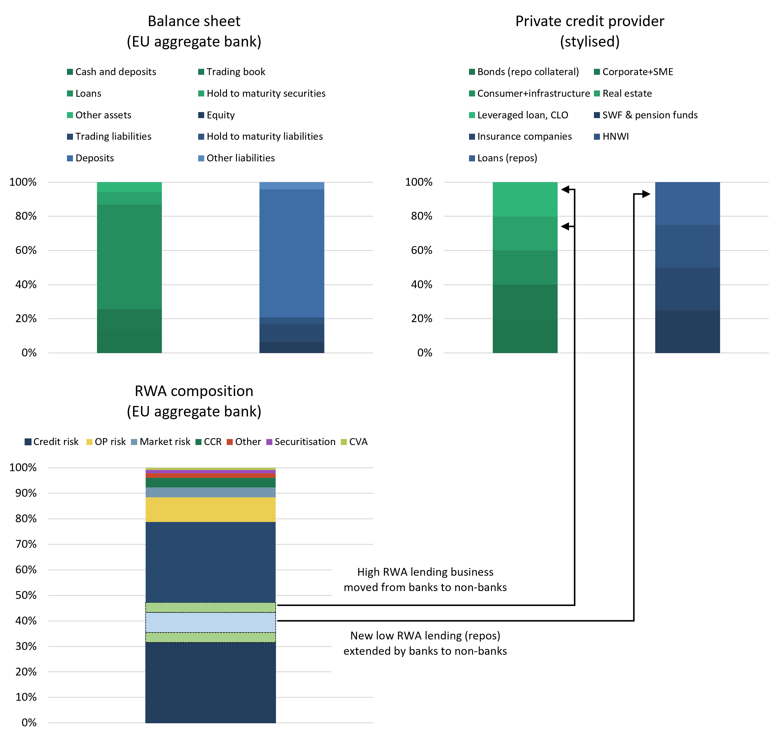
Figure 71: Illustrative examples of a bank’s and a private credit provider’s business and how they are linked

Illustrative examples of a bank’s and a private credit provider’s business and how they are linked

Source: EBA, using, for instance, anecdotal evidence, EBA Transparency Exercise data and further market research/analysis