List of figures


Figure 1: EU GDP growth rate QoQ, seasonally adjusted

Line chart with 10 data points.
(%)
The chart has 1 X axis displaying categories.
The chart has 1 Y axis displaying values. Data ranges from -0.2 to 0.8.
End of interactive chart.

Source: Eurostat

Figure 2a: EU average inflation rate

Line chart with 79 data points.
(%)
The chart has 1 X axis displaying categories.
The chart has 1 Y axis displaying values. Data ranges from 0.2 to 11.5.
End of interactive chart.

Source: Eurostat

Figure 2b: 3-month interbank rates of selected European currencies (*)

Line chart with 8 lines.
(%)
The chart has 1 X axis displaying categories.
The chart has 1 Y axis displaying values. Data ranges from 2.16 to 16.31.
End of interactive chart.

Sources: Refinitiv, Central Bank of Iceland, Central Bank of Romania

(*) EURIBOR (Euro Interbank Offered Rate), CIBOR (Copenhagen Interbank Offered Rate), BUBOR (Budapest Interbank Offered Rate), REIBOR (Reykjavík interbank offered rate), ROBOR (Romanian Interbank Offered Rate), STIBOR (Stockholm Interbank Offered Rate), WIBOR (Warsaw Interbank Offered Rate), NIBOR (Norwegian interbank offered rate). 


Figure 3: Percentage of total exposures towards countries and sectors vulnerable to geopolitical risks, by country, Jun-2024

Scatter chart with 31 points.
(%)
The chart has 1 X axis displaying % of total NFC loans to vulnerable sectors. Data ranges from 12.11 to 66.8.
The chart has 1 Y axis displaying % of total exposures to vulnerable countries . Data ranges from 0 to 10.78.
End of interactive chart.

Sources: Caldare and Iacoviello, Refinitiv Workspace, S&P Capital IQ, EBA supervisory data and calculations

Figure 4a: Debt-to-GDP levels for European countries

Combination chart with 2 data series.
(%)
The chart has 1 X axis displaying categories.
The chart has 1 Y axis displaying values. Data ranges from 13.24054054 to 182.0162162.
End of interactive chart.

Source: Eurostat

Figure 4b: Yields of selected European 10-year bonds

Line chart with 6 lines.
(%)
The chart has 1 X axis displaying categories.
The chart has 1 Y axis displaying values. Data ranges from 1.9 to 4.98.
End of interactive chart.

Source: Refinitiv

Figure 5: Performance of selected European industries equity indices

Line chart with 8 lines.
(Jan-24=100)
The chart has 1 X axis displaying categories.
The chart has 1 Y axis displaying values. Data ranges from 87.53 to 137.09.
End of interactive chart.

Source: Refinitiv

Figure 6: Chicago Board Options Exchange's Volatility Index

Line chart with 280 data points.
The chart has 1 X axis displaying categories.
The chart has 1 Y axis displaying values. Data ranges from 11.86 to 38.57.
End of interactive chart.

Source: Bloomberg

Figure 7: Eurostoxx Index and Bank Index Weekly Returns*

Bar chart with 2 data series.
(%)
The chart has 1 X axis displaying categories.
The chart has 1 Y axis displaying values. Data ranges from -8.8 to 4.09.
End of interactive chart.

Sources: Refinitiv, Bloomberg

(*) Eurostoxx (SXXE) Index and Euro Stoxx Bank (SX7E) Index which are part of the Eurostoxx Index, to secure comparable results. Eurostoxx Banks (SX7E) Index is a capitalisation-weighted index which includes listed banks in countries that are participating in the EMU.   


Figure 8: Selected European Banks Weekly changes of stock prices (%)

(*) The banks’ sample covers different European jurisdictions but with a heavier weight towards French banks, following the political events in France.


Figure 9a: Residential Real Estate prices index

Line chart with 2 lines.
(2015=100)
The chart has 1 X axis displaying categories.
The chart has 1 Y axis displaying values. Data ranges from 132.93 to 149.7.
End of interactive chart.

Source: Eurostat

Figure 9b: Euro area commercial real estate price index

Line chart with 41 data points.
(2011=100)
The chart has 1 X axis displaying categories.
The chart has 1 Y axis displaying values. Data ranges from 99.7 to 127.24.
End of interactive chart.

Source: ECB

Figure 10: EU/EEA banks’ asset exposures to NBFIs, as share of total assets by country, Jun-2024

Combination chart with 7 data series.
(%)
The chart has 1 X axis displaying categories.
The chart has 1 Y axis displaying values. Data ranges from 0.3 to 16.2.
End of interactive chart.

Source: EBA Supervisory Reporting data

Figure 11a: Trend in asset composition

Combination chart with 7 data series.
EUR tn
The chart has 1 X axis displaying categories.
The chart has 1 Y axis displaying values. Data ranges from 1.2 to 28.16.
End of interactive chart.

Source: EBA supervisory reporting data

Figure 11b: Growth in asset components

Line chart with 7 lines.
Jun-23 = 100
The chart has 1 X axis displaying categories.
The chart has 1 Y axis displaying values. Data ranges from 85.9 to 137.6.
End of interactive chart.

Source: EBA supervisory reporting data

Figure 12a: Growth in loans and advances by segment, with a focus on NFCs

Line chart with 5 lines.
Jun-23 = 100
The chart has 1 X axis displaying categories.
The chart has 1 Y axis displaying values. Data ranges from 99.1 to 101.8.
End of interactive chart.

Source: EBA supervisory reporting data

Figure 12b: Growth in loans and advances by segment, with a focus on HHs

Line chart with 4 lines.
Jun-23 = 100
The chart has 1 X axis displaying categories.
The chart has 1 Y axis displaying values. Data ranges from 99.9 to 103.7.
End of interactive chart.

Source: EBA supervisory reporting data

Figure 61b: M&A measures that EU/EEA banks are considering, autumn 2024

Bar chart with 8 bars.
(%)
The chart has 1 X axis displaying categories.
The chart has 1 Y axis displaying values. Data ranges from 8.2 to 41.2.
End of interactive chart.

Source: EBA Risk Assessment Questionnaire

Figure 14: Distribution by LTV of CRE loans, by country, Jun-2024

Combination chart with 5 data series.
% (left) and EUR bn (right)
The chart has 1 X axis displaying categories.
The chart has 2 Y axes displaying values, and values.
End of interactive chart.

Source: EBA supervisory reporting data

Figure 15a: Share of domestic and long-term sovereign exposures by country, Jun-2024

Scatter chart with 31 points.
(%)
The chart has 1 X axis displaying % of sovereign exposures towards the country the bank is domiciled. Data ranges from 1 to 98.
The chart has 1 Y axis displaying % of sovereign exposures with maturity > 1 year. Data ranges from 18 to 98.
End of interactive chart.

Source: EBA Supervisory Reporting data

Figure 15b: Change in domestic and long-term exposures, comparison with Jun-2022

Scatter chart with 31 points.
(p.p.)
The chart has 1 X axis displaying p.p. change in share of domestic exposures. Data ranges from -34.88 to 12.49.
The chart has 1 Y axis displaying p.p. change in share of exposures maturing > 1 year. Data ranges from -12.14 to 20.58.
End of interactive chart.

Source: EBA Supervisory Reporting data

Figure 16: Total losses from climate risk stress test relative to total exposure

Bar chart with 2 data series.
(%)
The chart has 1 X axis displaying categories.
The chart has 1 Y axis displaying values. Data ranges from -20.7 to 0.
End of interactive chart.

Source: EU-wide cross-sectoral assessment of climate-related financial risks

Figure 17: Main impediments for the further development of green retail loans (1-not relevant, 5-extremely relevant), autumn 2024

Bar chart with 5 data series.
(1-not relevant, 5-extremely relevant)
The chart has 1 X axis displaying categories.
The chart has 1 Y axis displaying values. Data ranges from 3.5 to 43.5.
End of interactive chart.

Source: EBA Risk Assessment Questionnaire

Figure 18: Definition of green used by banks for different loan segments, autumn 2024

Bar chart with 5 data series.
(%)
The chart has 1 X axis displaying categories.
The chart has 1 Y axis displaying values. Data ranges from 3.5 to 45.9.
End of interactive chart.

Source: EBA Risk Assessment Questionnaire

Figure 19: Trend of EU/EEA NPL volumes and ratio

Combination chart with 2 data series.
EUR bn (left), % (right)
The chart has 1 X axis displaying categories.
The chart has 2 Y axes displaying values, and values.
End of interactive chart.

Source: EBA supervisory reporting data

Figure 20: NPL cumulative net flows by segment

Bar chart with 4 data series.
EUR bn
The chart has 1 X axis displaying categories.
The chart has 1 Y axis displaying values. Data ranges from -1.29 to 10.81.
End of interactive chart.

Source: EBA Supervisory Reporting data

Figure 21: Distribution of NPL ratios by size of bank*, Jun-2024

Boxplot with 3 boxes. Box plot charts are typically used to display groups of statistical data. Each data point in the chart can have up to 5 values: minimum, lower quartile, median, upper quartile, and maximum.
95th, 5th percentiles and interquartile
The chart has 1 X axis displaying categories.
The chart has 1 Y axis displaying values. Data ranges from 0 to 17.
End of interactive chart.

Source: EBA Supervisory Reporting data

(*) Data of the charts is based on all credit institutions of EUCLID. For the list please refer here Registers and other list of institutions


Figure 22: NPL ratios, Stage 2 allocation and coverage ratios by segment, Jun-2024

Combination chart with 4 data series.
(%)
The chart has 1 X axis displaying categories.
The chart has 2 Y axes displaying values, and values.
End of interactive chart.

Source: EBA supervisory reporting data

Figure 23: Bankruptcy declarations in the EU by sector

Line chart with 9 lines.
(Jun-19 = 100)
The chart has 1 X axis displaying categories.
The chart has 1 Y axis displaying values. Data ranges from 62.06384558 to 165.8119658.
End of interactive chart.

Source: Eurostat

Figure 24: Expectations of asset quality deterioration in the next 6-12 months, autumn 2024

Bar chart with 4 data series.
(%)
The chart has 1 X axis displaying categories.
The chart has 1 Y axis displaying values. Data ranges from 1.2 to 85.9.
End of interactive chart.

Source: EBA Risk Assessment Questionnaire

Figure 25: Breakdown of financial liabilities composition by country, Jun-2024

Bar chart with 6 data series.
(%)
The chart has 1 X axis displaying categories.
The chart has 1 Y axis displaying values. Data ranges from 1.57 to 100.
End of interactive chart.

Source: EBA supervisory reporting data

Figure 26: EU/EEA banks’ issuance volumes YtD, by debt seniority, and share of green bonds per debt class*

Combination chart with 6 data series.
EUR bn (left) and % (right)
The chart has 1 X axis displaying categories.
The chart has 2 Y axes displaying values, and values.
End of interactive chart.

Source: Dealogic

(*) Cut-off date for this chart was 30 September 2024.


Figure 27a: Yield curve for European banks

Line chart with 3 lines.
(%)
The chart has 1 X axis displaying categories.
The chart has 1 Y axis displaying values. Data ranges from 2.19 to 3.92.
End of interactive chart.

Source: Bloomberg

Figure 27b: Cash asset swap (ASW) spreads of banks’ EUR-denominated debt and capital instruments

Line chart with 5 lines.
(bps)
The chart has 1 X axis displaying categories.
The chart has 2 Y axes displaying values, and values.
End of interactive chart.

Source: IHS Markit*

(*) With regard to IHS Markit in this chart and any further references to it in this report and related products, neither Markit Group Limited (‘Markit’) nor its affiliates nor any third-party data provider make(s) any warranty, express or implied, as to the accuracy, completeness or timeliness of the data contained herewith nor as to the results to be obtained by recipients of the data. Neither Markit nor its affiliates nor any data provider shall in any way be liable to any recipient of the data for any inaccuracies, errors or omissions in the Markit data, regardless of cause, or for any damages (whether direct or indirect) resulting therefrom.

Figure 28: Greenium of selected debt instruments

Line chart with 3 lines.
(in bps)
The chart has 1 X axis displaying categories.
The chart has 1 Y axis displaying values. Data ranges from -8.909140237 to 32.47176656.
End of interactive chart.

Source: Dealogic, IHS Markit, EBA calculations

Figure 29a: Rates of stock of NFC and household deposits of EU/EEA banks over time

Line chart with 2 lines.
(%)
The chart has 1 X axis displaying categories.
The chart has 1 Y axis displaying values. Data ranges from 0.14 to 2.78.
End of interactive chart.

Source: EBA supervisory reporting data

Figure 29b: YoY percentage point change of stock deposit rates, by country, Jun-2024

Bar chart with 2 data series.
(p.p.)
The chart has 1 X axis displaying categories.
The chart has 1 Y axis displaying values. Data ranges from -0.89 to 3.06.
End of interactive chart.

Source: EBA supervisory reporting data

Figure 30a: Funding instruments banks intend to focus on in the next 12 months

Bar chart with 5 data series.
(%)
The chart has 1 X axis displaying categories.
The chart has 1 Y axis displaying values. Data ranges from 1.2 to 53.3.
End of interactive chart.

Source: EBA Risk Assessment Questionnaire

Figure 30b: Measures they aim to take regarding their deposits and current accounts in the next 12 months, autumn 2024

Bar chart with 4 data series.
(%)
The chart has 1 X axis displaying categories.
The chart has 1 Y axis displaying values. Data ranges from 1.2 to 82.4.
End of interactive chart.

Source: EBA Risk Assessment Questionnaire

Figure 31: Total MREL resources by type of banks as % of RWA, Jun-2024

Bar chart with 8 data series.
(%)
The chart has 1 X axis displaying categories.
The chart has 1 Y axis displaying values. Data ranges from 15.3 to 37.5.
End of interactive chart.

Source: MREL & TLAC reporting, reporting of MREL decisions

Figure 32: MREL-eligible liabilities, by instrument, and by category of banks, for instruments with residual maturities between one and two years, Jun-2024

Bar chart with 3 data series.
(EUR bn)
The chart has 1 X axis displaying categories.
The chart has 1 Y axis displaying values. Data ranges from 0 to 121.6.
End of interactive chart.

Source: MREL & TLAC reporting, reporting of MREL decisions

Figure 33a: Preferred resolution tools by the number of banks, Jun-2024

Pie chart with 3 slices.
(%)
End of interactive chart.

Source: MREL & TLAC reporting, reporting of MREL decisions

Figure 33b: Variant resolution tool for entities with bail-in as preferred tool by number of banks, Jun-2024

Pie chart with 3 slices.
(%)
End of interactive chart.

Source: MREL & TLAC reporting, reporting of MREL decisions

Figure 34a: Preferred resolution tools by RWAs, Jun-2024

Pie chart with 3 slices.
(%)
End of interactive chart.

Source: MREL & TLAC reporting, reporting of MREL decisions

Figure 34b: Variant resolution tool for entities with bail-in as preferred tool by RWAs, Jun-2024

Pie chart with 3 slices.
(%)
End of interactive chart.

Source: MREL & TLAC reporting, reporting of MREL decisions

Figure 35: Binding MREL and subordination requirement by type of banks (% RWA), Jun-2024

Combination chart with 2 data series.
(% of RWA)
The chart has 1 X axis displaying categories.
The chart has 1 Y axis displaying values. Data ranges from 21.2 to 28.5.
End of interactive chart.

Source: MREL & TLAC reporting, reporting of MREL decisions

Figure 36: Main components of the LCR as a share of total assets

Combination chart with 4 data series.
(%)
The chart has 1 X axis displaying categories.
The chart has 2 Y axes displaying values, and values.
End of interactive chart.

Source: EBA supervisory reporting data

Figure 37: Evolution of gross outflow requirement (post-weights), Jun-2024

Bar chart with 2 data series.
(%)
The chart has 1 X axis displaying categories.
The chart has 1 Y axis displaying values. Data ranges from 0.3 to 18.3.
End of interactive chart.

Source: EBA Supervisory Reporting data

Figure 38a: EU/EEA banks' LCR weighted average and distribution

Combination chart with 2 data series.
(interquartile range, 5th and 95th percentiles) %
The chart has 1 X axis displaying categories.
The chart has 1 Y axis displaying values. Data ranges from 135.61 to 562.9.
End of interactive chart.

Source: EBA Risk Assessment Questionnaire

Figure 38b: Composition of liquid assets, Jun-2023 (outer circle) and Jun-2024 (inner circle)

Pie chart with 2 pies.
(%)
End of interactive chart.

Source: EBA supervisory reporting data

Figure 39a: Evolution of weighted average LCR for selected currencies

Line chart with 3 lines.
(%)
The chart has 1 X axis displaying categories.
The chart has 1 Y axis displaying values. Data ranges from 86.19 to 176.71.
End of interactive chart.

Source: EBA Risk Assessment Questionnaire

Figure 39b: Distribution of the LCR for selected currencies, Jun-2024

Boxplot with 3 boxes. Box plot charts are typically used to display groups of statistical data. Each data point in the chart can have up to 5 values: minimum, lower quartile, median, upper quartile, and maximum.
(Interquartile range and 5th and 95th percentiles) (%)
The chart has 1 X axis displaying categories.
The chart has 1 Y axis displaying values. Data ranges from 19.42 to 818.23.
End of interactive chart.

Source: EBA Supervisory Reporting data

Figure 40a: Net stable funding across EU/EEA countries, Jun-2024

Bar chart with 27 bars.
(%)
The chart has 1 X axis displaying categories.
The chart has 1 Y axis displaying values. Data ranges from 116.4 to 264.6.
End of interactive chart.

Source: EBA Supervisory reporting data

Figure 40b: Distribution of EU banks' NSFR ratio, ASF and RSF asset percentages, Jun-2024

Boxplot with 3 boxes. Box plot charts are typically used to display groups of statistical data. Each data point in the chart can have up to 5 values: minimum, lower quartile, median, upper quartile, and maximum.
(Interquartile range, 5th and 95th percentiles) (%)
The chart has 1 X axis displaying categories.
The chart has 1 Y axis displaying values. Data ranges from 10 to 243.
End of interactive chart.

Source: EBA supervisory reporting data

Figure 41a: Components of the NSFR (ASF), Jun-2024

Pie chart with 8 slices.
(%)
End of interactive chart.

Source: EBA supervisory reporting data

Figure 41b: Components of the NSFR (RSF), Jun-2024

Pie chart with 9 slices.
(%)
End of interactive chart.

Source: EBA supervisory reporting data

Figure 42: Capital ratios and leverage ratio

Combination chart with 4 data series.
(%)
The chart has 1 X axis displaying categories.
The chart has 2 Y axes displaying values, and values.
End of interactive chart.

Source: EBA supervisory reporting data

Figure 43: Trends in capital requirements and CET1 ratio

Combination chart with 9 data series.
(%)
The chart has 1 X axis displaying categories.
The chart has 1 Y axis displaying values. Data ranges from 4.5 to 16.1.
End of interactive chart.

Source: EBA supervisory reporting data

Figure 44: Trends in capital buffer requirements

Bar chart with 4 data series.
(%)
The chart has 1 X axis displaying categories.
The chart has 1 Y axis displaying values. Data ranges from 2.5 to 4.57.
End of interactive chart.

Source: EBA supervisory reporting data

Figure 45: Capital requirements and CET1 ratio by country, Jun-2024

Combination chart with 8 data series.
(%)
The chart has 1 X axis displaying categories.
The chart has 1 Y axis displaying values. Data ranges from 4.5 to 23.39.
End of interactive chart.

Source: EBA supervisory reporting data

Figure 46: CET1 components and adjustments

Bar chart with 6 data series.
EUR bn
The chart has 1 X axis displaying categories.
The chart has 1 Y axis displaying values. Data ranges from -149.25 to 1842.58.
End of interactive chart.

Source: EBA supervisory reporting data

Figure 47: RWA by type of risk

Bar chart with 4 data series.
EUR tn
The chart has 1 X axis displaying categories.
The chart has 1 Y axis displaying values. Data ranges from 0.87 to 9.78.
End of interactive chart.

Source: EBA supervisory reporting data

Figure 48a: Exposures for selected exposure classes, excluding securitisation and equity

Bar chart with 6 data series.
EUR tn
The chart has 1 X axis displaying categories.
The chart has 1 Y axis displaying values. Data ranges from 2.17 to 26.97.
End of interactive chart.

Source: EBA supervisory reporting data

Figure 48b: Credit RWA for selected exposure classes, excluding securitisation and equity

Bar chart with 6 data series.
EUR tn
The chart has 1 X axis displaying categories.
The chart has 1 Y axis displaying values. Data ranges from 1 to 7.45.
End of interactive chart.

Source: EBA supervisory reporting data

Figure 49: YoY changes in credit risk RWA and exposures for selected exposures classes, Jun-2024

Bar chart with 2 data series.
(%)
The chart has 1 X axis displaying categories.
The chart has 1 Y axis displaying values. Data ranges from -3 to 3.9.
End of interactive chart.

Source: EBA supervisory reporting data

Figure 50: RoE and contribution of the main profit and loss (P&L) items to the RoE’s YoY change, comparison between Jun-2023 and Jun-2024

Chart with 12 data points. A waterfall chart is a column chart where each column contributes towards a total end value.
(%)
The chart has 1 X axis displaying categories.
The chart has 1 Y axis displaying values. Data ranges from 9 to 12.040000000000001.
End of interactive chart.

Source: EBA supervisory reporting data

Figure 51: EU/EEA banks’ estimates of their cost of equity

Bar chart with 5 data series.
(%)
The chart has 1 X axis displaying categories.
The chart has 1 Y axis displaying values. Data ranges from 4.7 to 43.3.
End of interactive chart.

Source: EBA Risk Assessment Questionnaire

Figure 52a: Evolution of RoE by country

Bar chart with 2 data series.
(%)
The chart has 1 X axis displaying categories.
The chart has 1 Y axis displaying values. Data ranges from 5.78 to 28.73.
End of interactive chart.

Source: EBA supervisory reporting data

Figure 52b: Revenue composition by country, Jun-2024

Bar chart with 4 data series.
(%)
The chart has 1 X axis displaying categories.
The chart has 2 Y axes displaying values, and values.
End of interactive chart.

Source: EBA supervisory reporting data

Figure 53a: Evolution of asset management fee income as share of assets under management by country and on EU/EEA level

Bar chart with 4 data series.
(%)
The chart has 1 X axis displaying categories.
The chart has 1 Y axis displaying values. Data ranges from 0 to 1.37.
End of interactive chart.

Source: EBA supervisory reporting data

Figure 53b: Current account related fees as share of current account / overnight deposit volumes by country and on EU/EEA level*

Bar chart with 4 data series.
(%)
The chart has 1 X axis displaying categories.
The chart has 1 Y axis displaying values. Data ranges from 0.01 to 0.71.
End of interactive chart.

Source: EBA supervisory reporting data

(*) The fee income component is Q2 annualised data for each of the years


Figure 54: Banks’ targets for profitability increase in the next 6 to 12 months

Bar chart with 5 data series.
(%)
The chart has 1 X axis displaying categories.
The chart has 1 Y axis displaying values. Data ranges from 1.2 to 70.6.
End of interactive chart.

Source: EBA Risk Assessment Questionnaire

Figure 55a: Evolution of key components of costs and expenses as share of equity, EU/EEA level

Bar chart with 6 data series.
(%)
The chart has 1 X axis displaying categories.
The chart has 1 Y axis displaying values. Data ranges from 10.2 to 24.7.
End of interactive chart.

Source: EBA supervisory reporting data

Figure 55b: Key components of costs and expenses as share of equity, by country, Jun-2024

Bar chart with 6 data series.
(%)
The chart has 1 X axis displaying categories.
The chart has 1 Y axis displaying values. Data ranges from -1.3 to 38.4.
End of interactive chart.

Source: EBA supervisory reporting data

Figure 56: Cost to income ratio, by country and on EU/EEA level

Bar chart with 2 data series.
(%)
The chart has 1 X axis displaying categories.
The chart has 1 Y axis displaying values. Data ranges from 32.17 to 79.56.
End of interactive chart.

Source: EBA supervisory reporting data

Figure 57: Cost of risk, by country and on EU/EEA level*

Bar chart with 2 data series.
(%)
The chart has 1 X axis displaying categories.
The chart has 1 Y axis displaying values. Data ranges from -0.07 to 2.53.
End of interactive chart.

Source: EBA supervisory reporting data

(*) Data for LT skewed higher due to the sample, which include rather high-risk banks and not the biggest national lenders.
 

Figure 58a: Evolution of RoE by business model

Line chart with 6 lines.
(%)
The chart has 1 X axis displaying categories.
The chart has 1 Y axis displaying values. Data ranges from -5.03 to 12.13.
End of interactive chart.

Source: EBA supervisory reporting data

Figure 58b: RoE and its key income components as share of equity, by business model, Jun-2024

Combination chart with 5 data series.
(%)
The chart has 1 X axis displaying categories.
The chart has 2 Y axes displaying values, and values.
End of interactive chart.

Source: EBA supervisory reporting data

Figure 59: Key components of costs and expenses as share of equity, by business model, Jun-2024

Bar chart with 6 data series.
(%)
The chart has 1 X axis displaying categories.
The chart has 1 Y axis displaying values. Data ranges from 4.01 to 26.98.
End of interactive chart.

Source: EBA supervisory reporting data

Figure 60: Measures banks are primarily taking to reduce their operating expenses / costs 

Bar chart with 5 data series.
(%)
The chart has 1 X axis displaying categories.
The chart has 1 Y axis displaying values. Data ranges from 6.7 to 96.5.
End of interactive chart.

Source: EBA Risk Assessment Questionnaire

Figure 61a: EU/EEA banking sector related M&A transactions since 2022 (per year in 2022 and 2023, and YtD 2024), number and volume*

Combination chart with 6 data series.
EUR mn (left axis) and numbers (right axis)
The chart has 1 X axis displaying categories.
The chart has 2 Y axes displaying values, and values.
End of interactive chart.

Source: S&P Capital  IQ, and EBA assumptions and calculations

(*) Completed transactions – including whole company, minority, branches and assets acquisitions and / or mergers – involving a bank in the EEA as geography. Private equity deals are included. The volume related information / data is only available for some of the transactions, for which reason the number of deals might be considered as more relevant.


Figure 61b: M&A measures that EU/EEA banks are considering, autumn 2024

Bar chart with 8 bars.
(%)
The chart has 1 X axis displaying categories.
The chart has 1 Y axis displaying values. Data ranges from 8.2 to 41.2.
End of interactive chart.

Source: EBA Risk Assessment Questionnaire

Figure 62a: EU vs. US banks’ RoE*

Line chart with 2 lines.
(%)
The chart has 1 X axis displaying categories.
The chart has 1 Y axis displaying values. Data ranges from 0.556710449 to 14.69653162.
End of interactive chart.

Source: Federal Reserve Bank of New York and EBA supervisory reporting data, EBA calculations

(*) For the US data the Federal Reserve Bank of New York’s “Quarterly Trends for Consolidated U.S. Banking Organizations” as of Q2 2024 is used.


Figure 62b: EU vs. US banks’ leverage ratio

Line chart with 2 lines.
(%)
The chart has 1 X axis displaying categories.
The chart has 1 Y axis displaying values. Data ranges from 5.205785522 to 9.23.
End of interactive chart.

Source: Federal Reserve Bank of New York and EBA supervisory reporting data, EBA calculations

Figure 63a: EU vs. US banks’ NII as share of equity

Line chart with 2 lines.
(%)
The chart has 1 X axis displaying categories.
The chart has 1 Y axis displaying values. Data ranges from 17 to 27.09.
End of interactive chart.

Source: Federal Reserve Bank of New York and EBA supervisory reporting data, EBA calculations

Figure 63b: EU vs. US banks’ NIM

Line chart with 2 lines.
(%)
The chart has 1 X axis displaying categories.
The chart has 1 Y axis displaying values. Data ranges from 1.238606497 to 2.8.
End of interactive chart.

Source: Federal Reserve Bank of New York and EBA supervisory reporting data, EBA calculations

Figure 64a: EU vs. US banks’ cost to income ratio

Line chart with 2 lines.
(%)
The chart has 1 X axis displaying categories.
The chart has 1 Y axis displaying values. Data ranges from 53.22744726 to 77.62165317.
End of interactive chart.

Source: Federal Reserve Bank of New York and EBA supervisory reporting data, EBA calculations

Figure 64b: EU vs. US banks’ cost of risk*

Line chart with 2 lines.
(in bps)
The chart has 1 X axis displaying categories.
The chart has 1 Y axis displaying values. Data ranges from -50 to 230.
End of interactive chart.

Source: Federal Reserve Bank of New York and EBA supervisory reporting data, EBA calculations

(*) For the US banks’ cost of risk the annualised loan loss provisions as percentage of total loans from the data the Federal Reserve Bank of New York’s US banking sector data are used.


Figure 65: EU vs. US banks’ PtB multiples, using the EuroStoxx banks (SX7E) and the S&P US banks index (S5BANKX)*

Line chart with 2 lines.
The chart has 1 X axis displaying categories.
The chart has 1 Y axis displaying values. Data ranges from 0.27 to 1.54.
End of interactive chart.

Source: Bloomberg

(*) The Bloomberg query INDX_PX_BOOK was used for this analysis.


Figure 66: Main drivers of operational risk as seen by banks*

Bar chart with 5 data series.
(%)
The chart has 1 X axis displaying categories.
The chart has 1 Y axis displaying values. Data ranges from 0 to 80.
End of interactive chart.

Source: EBA Risk Assessment Questionnaire

(*) Agreement to up to three options was possible for respondents.


Figure 67: Number of new operational risk events over time and total losses in operational risk as a share of CET1*

Combination chart with 2 data series.
The chart has 1 X axis displaying categories.
The chart has 2 Y axes displaying values, and values.
End of interactive chart.

Source: EBA supervisory reporting data

(*) Gross loss amount from new events and loss adjustments relating to previous reporting periods.


Figure 68: Total losses in new operational risk in 2023 as a share of CET1, by country

Bar chart with 31 bars.
(%)
The chart has 1 X axis displaying categories.
The chart has 1 Y axis displaying values. Data ranges from 0.04 to 10.95.
End of interactive chart.

Source: EBA supervisory reporting data

Figure 69: Number (in intervals) of cyberattacks to which banks fell victim in the first half of 2024 that resulted or could have potentially resulted in a 'major ICT-related incident' in the last semi-annual assessment period*

Bar chart with 5 data series.
(%)
The chart has 1 X axis displaying categories.
The chart has 1 Y axis displaying values. Data ranges from 1.2 to 55.
End of interactive chart.

Source: EBA Risk Assessment Questionnaire

(*) This relates to an ICT-related incident with a potentially high adverse impact on the network and information systems that support critical functions of the financial entity (Article 3(8) DORA).


Figure 70: Financial crime risks, January 2024 – August 2024

Figure 70: Financial crime risks, January 2024 – August 2024


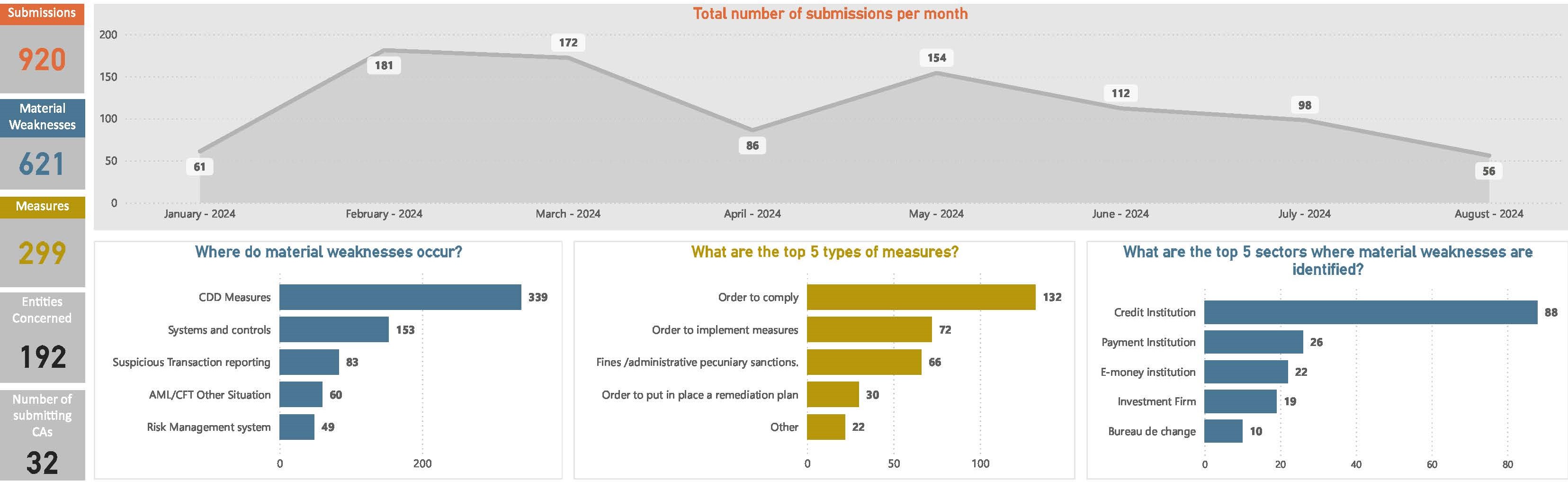
Figure 71a: Net provisions for pending legal issues and tax litigation as a share of total assets for the EU (2021–2023)

Line chart with 3 data points.
(%)
The chart has 1 X axis displaying categories.
The chart has 1 Y axis displaying values. Data ranges from 0.0128 to 0.0201.
End of interactive chart.

Source: EBA supervisory reporting data

Figure 71b: Net provisions for pending legal issues and tax litigation as a share of total assets by country (2023)

Bar chart with 30 bars.
(%)
The chart has 1 X axis displaying categories.
The chart has 2 Y axes displaying values, and values.
End of interactive chart.

Source: EBA supervisory reporting data

Figure 72: Number and shares by sector of alleged greenwashing incidents in the EU financial and banking sector

Combination chart with 4 data series.
The chart has 1 X axis displaying categories.
The chart has 2 Y axes displaying values, and values.
End of interactive chart.

Source: RepRisk database*

Figure 73a: Proportion of EU banks using different technologies

Line chart with 10 lines.
(%)
The chart has 1 X axis displaying categories.
The chart has 1 Y axis displaying values. Data ranges from 1 to 88.
End of interactive chart.

Source: EBA Risk Assessment Questionnaire

Figure 73b: Uses of AI by EU banks per use case in 2024, autumn 2024

Bar chart with 8 bars.
(%)
The chart has 1 X axis displaying categories.
The chart has 1 Y axis displaying values. Data ranges from 17.65 to 71.76.
End of interactive chart.

Source: EBA Risk Assessment Questionnaire

Figure 74: Evolution of the adoption level of AI by EU banks

Line chart with 5 lines.
(%)
The chart has 1 X axis displaying categories.
The chart has 1 Y axis displaying values. Data ranges from 1.18 to 85.88.
End of interactive chart.

Source: EBA Risk Assessment Questionnaire

Figure 75: Proportion of EU banks using GPAI, per use case, autumn 2024

Bar chart with 8 bars.
(%)
The chart has 1 X axis displaying categories.
The chart has 1 Y axis displaying values. Data ranges from 0 to 42.35.
End of interactive chart.

Source: EBA Risk Assessment Questionnaire

Figure 76: Proportion of banks testing GPAI, but still not using it in production, per use case, autumn 2024

Bar chart with 9 bars.
(%)
The chart has 1 X axis displaying categories.
The chart has 1 Y axis displaying values. Data ranges from 0.8 to 9.33.
End of interactive chart.

Source: EBA Risk Assessment Questionnaire

Figure 77a: Diversity of deployment approaches by banks for GPAI. autumn 2024

Pie chart with 6 slices.
End of interactive chart.

Source: EBA Risk Assessment Questionnaire

Figure 77b: Deployment approaches adopted by banks to integrate or adopt AI (in general) and GPAI, autumn 2024

Bar chart with 3 data series.
(%)
The chart has 1 X axis displaying categories.
The chart has 1 Y axis displaying values. Data ranges from 18 to 59.
End of interactive chart.

Source: EBA Risk Assessment Questionnaire

Figure 78: Proportion of banks investing or planning to invest in GPAI (investment levels as % of equity), autumn 2024

Bar chart with 2 data series.
(%)
The chart has 1 X axis displaying categories.
The chart has 1 Y axis displaying values. Data ranges from 0 to 73.
End of interactive chart.

Source: EBA Risk Assessment Questionnaire

Figure 79: Share of loans with forbearance measures over all household loans, by country (MC1)

Bar chart with 2 data series.
(%)
The chart has 1 X axis displaying categories.
The chart has 1 Y axis displaying values. Data ranges from 0.2 to 13.7.
End of interactive chart.

Source: EBA supervisory reporting data

Figure 80: Share of NPLs collateralised by immovable property over all loans collateralised by immovable property, by country (MC2)

Bar chart with 2 data series.
(%)
The chart has 1 X axis displaying categories.
The chart has 1 Y axis displaying values. Data ranges from 0.2 to 8.6.
End of interactive chart.

Source: EBA supervisory reporting data

Figure 81: Share of NPLs from credit for consumption over all credit for consumption, by country (OCL1)

Bar chart with 2 data series.
(%)
The chart has 1 X axis displaying categories.
The chart has 1 Y axis displaying values. Data ranges from 0.7 to 10.2.
End of interactive chart.

Source: EBA supervisory reporting data

Figure 82: Percentage of deposit interest expenses paid by banks to households over total household deposits, by country (PDA1)

Bar chart with 2 data series.
(%)
The chart has 1 X axis displaying categories.
The chart has 1 Y axis displaying values. Data ranges from 0 to 5.6.
End of interactive chart.

Source: EBA supervisory reporting data

Figure 83: Share of fraudulent card payments over total card payments - volume and value, by country

Bar chart with 2 data series.
The chart has 1 X axis displaying categories.
The chart has 1 Y axis displaying values. Data ranges from 0.0029 to 0.0627.
End of interactive chart.

Source: EBA payment fraud reporting data

Figure 84: Share of fraudulent credit transfer over total credit transfers - volume and value, by country

Bar chart with 2 data series.
The chart has 1 X axis displaying categories.
The chart has 1 Y axis displaying values. Data ranges from 0.0004 to 0.0055.
End of interactive chart.

Source: EBA payment fraud reporting data

Figure 85: Fraud losses borne by users of card payments in 2022 and 2023, by country

Bar chart with 2 data series.
(EUR mn)
The chart has 1 X axis displaying categories.
The chart has 1 Y axis displaying values. Data ranges from 0 to 214.96.
End of interactive chart.

Source: EBA payment fraud reporting data

Figure 86: Fraud losses borne by users of credit transfers in 2022 and 2023, by country

Bar chart with 2 data series.
(EUR mn)
The chart has 1 X axis displaying categories.
The chart has 1 Y axis displaying values. Data ranges from 0 to 363.28.
End of interactive chart.

Source: EBA payment fraud reporting data

Figure 87a: Percentage of people aged 15+ who have a bank account (AFS1) - 2021, by country

Bar chart with 29 bars.
The chart has 1 X axis displaying categories.
The chart has 1 Y axis displaying values. Data ranges from 69 to 100.
End of interactive chart.

Source: World Bank

Figure 87b: Percentage of people aged 15+ who have a debit card (AFS2) - 2021, by country

Bar chart with 29 bars.
(%)
The chart has 1 X axis displaying categories.
The chart has 1 Y axis displaying values. Data ranges from 53 to 99.
End of interactive chart.

Source: World Bank

Figure 88: Percentage of people aged 15+ who borrowed from family or friends (AFS3) - 2021, by country

Bar chart with 29 bars.
(%)
The chart has 1 X axis displaying categories.
The chart has 1 Y axis displaying values. Data ranges from 5 to 30.
End of interactive chart.

Source: World Bank